So I’ve been thinking of branching out into colour...
In many undergraduate art programs – your first 6 months in school you get two colours to work with: – pencil, (or ink) – and the white of a page to work with. It teaches you shade and light and helps develop the finesse of your line stroke. I remember thinking it ridiculous to take away our colours. Then in the final semester you are given sepia to work with, and then a few classes later, a blue to act as a low to the sepia high – and I so clearly remember feeling overwhelmed in drawing class with the extra spectrum. (that or sepia and blue don’t go well together...)
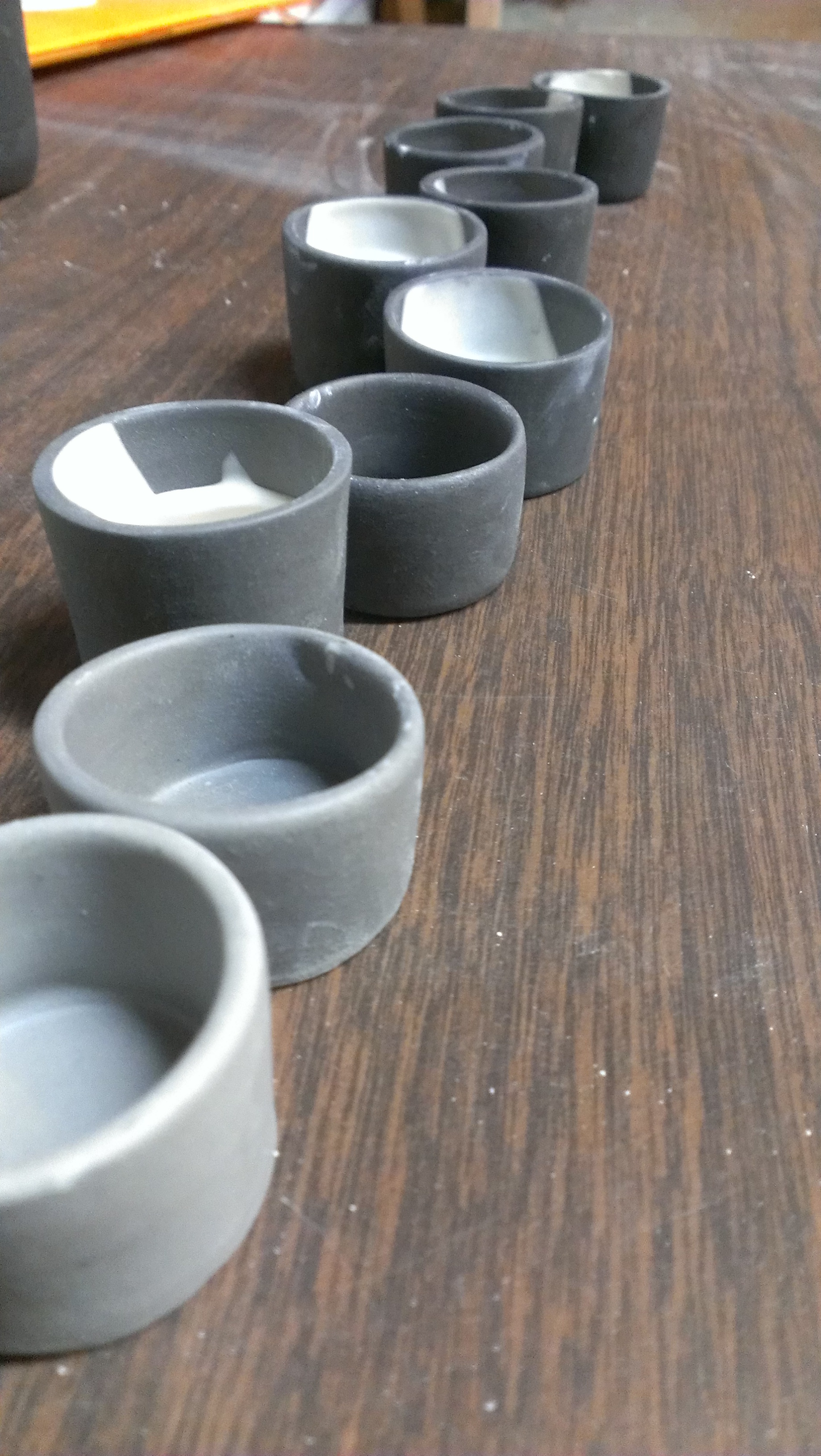
For the past year, I think I subconsciously kept myself on a similar path with the blue & white. Learning my material and it's quirks – developing my application (/ like my line stroke at Parson's.) So now I’m looking to add one more colour – a grey black.
(Okay, 4 years at Parson’s and a healthy exposure to pedants – black is the absence of colour… but let's not go there.)
I was happy with my initial slip colour blot tests and they were nice tones – but then I tested them with my go-to Chun glaze… the troubles started. The cobalt based glazes were coming up blue where the glaze was, and then when that didn’t happen the iron in my glaze would pull out a lovely, if undesired coffee toffee brown.
So I’m testing a few commercial glazes & a lot of recipes I’ve found in PNW's extensive library and around the internet too. I’ve not quite nailed it... with work as thin as mine, and only glazing one side requires a lot of elasticity in the glaze – and so far I’ve been met with a lot of crazing. But I’m sure to get there soon enough…
Meanwhile I’m playing with the back / grey spectrum – and I’m really happy with the early results I’m getting.